With the revolution of 1979, graphics of writings in public spaces, like many fields of visual representations, underwent a great stylistic transformation. What was institutionally pursued throughout the first decade or so, was an innovative re-appropriation of epical and scriptural styles of writing in the Iranian/Islamic traditions. It soon became the significant part of the public disposition of the social and ideological atmosphere of time, especially during the Iran-Iraq war, what to be referred to as the revolutionary graphics. Now many different styles of typography are applied, some even as pastiches of the revolutionary style – which still remains to be present in the city, even if it is for its past traces on the city walls.
The following is a conversation between graphic-designer Farhad Fozouni, cultural critic Hamed Yousefi and the editors of Pages magazine that took place in Tehran in spring of 2007. Starting from his recent posters, themselves a take and a reaction to such graphics, the discussion revolves around the effects of revolutionary graphics on the experience of the Iranian city, and its influence on the practice of graphic design.
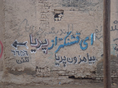
Page(P): When we walk along Enghelab (revolution) Street, from a graphical point of view, we face different typefaces – each of which belong to a different period of the history of this street. Some of the typefaces are reminiscent of the pre-revolutionary period, some belong to the first years of revolution, others are just the letters conveying temporary and timeless information. What attracts the attention along Enghelab Street are the historical, ideological, and cultural differences of these typefaces. Farhad, as graphic artist, do you find yourself concerned with or influenced by this?
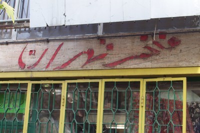
Farhad Fozouni(FF): Enghelab Street is really a strange place. You can see representatives of the whole of Iranian society in this street. People of different classes pass each other without being annoyed (whereas in other parts of the city they might not cohabit so easily). Enghelab Street is in a way a summary of Tehran. There are a lot of bookshops beside each other in this street and several universities including Tehran University, Free University, and Art University are in that area. At Vali-Asr crossroads there are the Vahdat Hall and the City Theatre. Most of the artists and intellectuals pass along the Street at least once a month. Therefore, Enghelab Street – from Enghelab Square to Vali-Asr crossroads – is the most important place to put our posters. Essentially, our posters are designed to be pasted in Enghelab Square and Enghelab Street (and secondarily in other places of the city). We often stick the posters in the windows of the shops. During a week the posters on the shops’ doors are changed several times or the new ones are pasted over the previous ones. An interesting point is that we print large posters but we have devised some innovations for places with less space. In some cases I had to anticipate the possibility of cutting the posters so that we could convert 100 X 70-cm posters to 50 x 70-cm ones. I can say that we, the designers of cultural graphics, have a role in the appearance of Enghelab Street. In addition to the posters, the cover designs of the books, CDs, and magazines in the windows of the bookshops are of the most important images seen in Enghelab Street. In fact Enghelab Street is a space for presenting and displaying cultural graphics.
Hamed Yousefi(HY): Perhaps there are more texts and images in Enghelab Street than in any other street. In this street, whoever wants to give any information to others can hang it there, and so the street is full of texts and images. They are not merely art and cultural shops, all the shops, even the fruit juice shops, hang something. If we look at the situation from a different viewpoint, then we might consider that this form, the form of hanging announcements, would provide the possibility for us to write different things on the placards. A kind of potential for objection could be seen in this form. Recently, they have turned the railings of Tehran University into a kind of street gallery. Tehran municipality install artists’ laminated works onto the two-kilometre railings of the university, facing the street. Up to now, almost all the works have had religious themes. It seems that even the municipality wants to have a share in this poster sticking and announcement hanging, perhaps unaware of the fact that it increases the overall legitimacy of hanging.
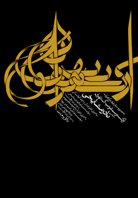
FF: When we think of the concept of street, we would like our streets to look European. In our films, we try to show parts of the streets that seem more European. When we write a story, our characters do not get on the metro or buses we have here. Usually, our artists have almost no relation with their public spaces. Our public spaces are television, radio, newspapers and the street – of these the street is perhaps the most important. The space of our streets is totally different from the posters that are installed along them. Is this good or bad? This was a question that used to engage my mind. My posters reflected my ideals. Now my view has changed and I try to show the reality. I would like my posters to be a documentary of the condition that we live in. I think that Enghelab Street is very close to my nostalgia of wartime and the beginning of the revolution. This is a nostalgia that I no longer try to evade but try to somehow reflect it in my works. My new works are formed on the basis of this mentality. That is, I try to add an interpretation of the space of the street to my graphic design. In the poster of Cinema and Spirituality I think the space of the poster is very close to the space of our streets; anybody who has seen our streets would find their relevance to the poster. I have recently been taking photographs of the streets and I look at them again and again. This helps me very much. For instance, I now see that the dominant colours in Tehran are green, red, white, gold and black. In some cases yellow is also used (instead of gold). In religious banners and ceremonies these colours are quite dominant. In religious ceremonies the visual culture of Iran can be seen quite clearly. In the poster Neynava, which was ordered for Neynava concert performed by Hossein Alizadeh (I hear that Alizadeh created Neynava for the social space of the war and the revolution) I got inspiration from the posters of the revolution and the war period and the religious banners. It is interesting for me to translate intellectual spaces into public graphics. Blending an intellectual space, for example, Tehran’s symphonic orchestra with religious graphics renders everything odd. In fact it is a kind of satirical view. Both aspects would be questioned, as would I, as the designer.
P: So you find religious design and calligraphy, which became increasingly visible after the revolution, to be the dominant graphics of the city. But why do you use the term “nostalgia” for something you see every day?
FF: Perhaps that is because the intellectuals have omitted all these elements in their private domain and don’t see them. Why don’t we look at the everyday things between our homes and work places? At work we are in contact with our colleagues, and then, on the way back home, we again try not to look at anything. Now I am re-looking. I was born in the midst of the revolution, living in Kermanshah, a city bordering Iraq. For 7 years (between the age of 2 to 9) during the war I never heard the white alarm [the least urgent of the air raid signels]. There were only red and yellow alarms and the city was always at risk of air raids. At that time, when I watched TV, there was always Azan (the call to prayer) in the middle of a children’s program. Naturally such an atmosphere has had its influence on me. I neither like it nor dislike it. It is my nostalgia. The Arabic handwriting is my nostalgia.
P: Then why do you introduce satire into it?
FF: It is natural, because in some cases you don’t want to accept it, and this is the critical aspect of the issue. Nevertheless you remember that it belongs to you. We no longer look at our work very poetically or romantically. We even sometimes play jokes on ourselves. When satire enters the work, in fact it treats the whole condition as a joke.
P: It seems that many artists use satire as a means of expression in Iranian visual arts or graphics. However, it doesn’t seem to have an analytic dimension.
FF: What is recently seen in the works of our artists is not satire, it is lampoon. Perhaps that’s the reason you can’t relate to it. However, when you live in Iran under these conditions you find it enjoyable. As an example, to understand what Kill Bill is about you must have seen Hollywood and Bollywood movies and martial arts films of the Far East. In the same way, satire and lampoon in our contemporary art is only defined in the context of Iran.
P: In fact you tell your potential audience that if they want to understand your work they must be living in Iran. Should using local subjects limit the audience of an artist to a particular place and separate their work from communicating worlwide?
FF: This problem exists, but I always think that it is difficult to separate art from its social context. Now that the social condition in Iran has become so different from that of other countries, the condition of Iranian contemporary art necessarily becomes more complicated. This condition is perhaps not so much of a glory for Iranian art, and it doesn’t help it become universal, but it is true and we must accept that there is a deep gap there.
P: It’s true that art is related to its social context. The problem you pointed to is perhaps related to the fact that we are more interested in the western issues than others. But in a work of art, it is in the scope of universal art that the local issues would become significant. That is, when, for example, it questions the dominant view in art concerning the concepts of local and global. Wouldn’t it be the responsibility of the artist to expand the local issues to a more extensive discourse?
FF: If I want to make my poster understandable for a foreigner, I have to attach my self, Enghelab Street, the Islamic Republic of Iran’s radio and television, and many other things to my poster, because it is full of references to such things. But what is the solution? I exist along with all the things in Enghelab Street, the Iranian television, and the nostalgia for my childhood that has remained with me since the war. Without these things, how different would I be from a Swiss or American designer? Should I only refer to Coca-Cola and the Mickey Mouse so that everybody could understand my work? My nostalgia is different. It is not Mickey Mouse.
P: In a certain period, Iranian intellectual artists wanted to regress to the nostalgia of ancient Iran in the face of western modernism, but since the revolution, another nostalgia has replaced it. Isn’t the Iranian artists’ involvement in nostalgia because historically the present has always been so unsatisfactory , nostalgia allows them to establish their relation with the present?
FF: My work is really neither lampoon, nor satire, nor is it born from nostalgia. Perhaps it is a mix of all these things. If we insist on emphasising one of these things the work would surely seem foolish because there are also other things in it. My work at least introduces a kind of change into the pictorial condition.
P: Every governing system has its own aesthetics. But what happens in your posters is a kind of replacement of that dominant or street aesthetics that tries to apply the change in the pictorial condition, which is a critical event in the framework of contemporary graphic art. At the same time, it can also represent the spread of the dominant aesthetic. The borderline between the two is very delicate in your works.
FF: I accept that, this border is very delicate. Perhaps I expect too much of the audience to understand it but I do not like to give direct hints. In some ways I put all my hope in the more intelligent viewers. I hope there are many of them. But perhaps I have to withdraw a little bit from my position and make my references more clear. I am seeking a new aesthetics based on the aesthetics of the public space of Tehran. This would be a revolutionary act or even a suicidal operation, in which I might lose the credit I have gained with my present audience. This is a risk that I have accepted because I believe in what I am doing. On the one hand I make a kind of social irony out of what I borrow from Tehran’s streets, shop facades, placards, and religious banners, on the other hand I am seeking the aesthetics that I mentioned.
HY: Well, what is significant and attracts the critical attention is normally not a natural and neat situation. When a store is in its normal condition, its facade and window are in a good shape, its colour and luster catches the eyes, and finally it presents itself in a superior way, it would not attract any critical attention. This shop becomes important when, 20 years later, it has turned into a semi-dilapidated place where nobody goes – it is when it is covered with dust and its stylish facade is distorted that the shop can reflect the spirit of our time. The cultural sovereignty becomes interesting when it is dethroned. When a graphic artist puts the font neatly on his or her poster, it is as if they have identified with that throned hegemony. The poster of an anti-hegemonic exhibition or film, which wants to disrupt the current belief and question the dominant element of aesthetics to create a critical situation, can no more be neat and orderly. If in such a situation we stick a ship-shape poster on the wall, then we have submitted to that dominant aesthetic element and have created a work in the domain of commercial advertisement. But dethroning the hegemony of aesthetics itself creates a new aesthetics, which is the moment when, after 20 years of installation of the signboard, its fonts are falling down. As though the fonts too object to the spirit of the time and to its commercial aesthetics of deception.
P: This means that with this kind of attitude towards the graphic elements of the city you are also making a social analysis. But all the large and complex cities in the world show such elements. This is not specific to Iran.
HY: When you walk in the city, with which shop do you identify with more: The neat Chanel or the World Tricot, which Chanel ,through allegations and collusion, tried to expel it from the market?
P: Well, it could be both of them.
HY: But I don’t identify with that Chanel store. For me, the truth of the case is the moment that the glory of the Chenel store suddenly finds a new face of illegitimacy in rivalry and the elimination of the smaller manufacturers.
P: Even in Chanel that critical situation can be seen. The question is whether you seek it in the level of form or content.
HY: Absolutely in form. The graphics of the signboard of a shop shows its critical condition in the moment when that prepared neat appearance (which is evident when it’s news) is no longer there, that is when it enters the normal condition of its life. But it is interesting that even if one third of the letters of the signboard have fallen down, we can still read it, it still maintains its informative function.
P: Isn’t it that you are looking at your surrounding metaphorically? How can this be critical?
HY: That critical moment can be a metaphor of the whole situation.
P: Can’t that critique be more effective if you seek this critical situation in, for example, the same Chanel, rather than you propound those disorderly and fallen fonts as the metaphor of critique?
HY: Perhaps the example of Chanel was not a suitable one because it was an example of a society in which capitalism works conveniently. In the Iranian society, if capitalism works for 10 minutes, it will stop for one hour. An example is ICUT, which is one of the greatest manufacturers of men’s clothing in Iran. It is a creditable brand with beautiful manikins and window displays. But if you look closely at the management of ICUT, you will see how unstable their capitalism is. It is not comparable to Chanel that can exist for centuries, or change direction on a decision. As for ICUT, when you look at its fresh signboard, you can already imagine its fallen signboard. There is perhaps one decade between its glory and its demise. It’s not that the greater capitalists swallowed it – the case is totally different. Perhaps it is for this reason that I have recently come to feel that in our society resistance could take place through capitalism rather than being against it. However, aesthetics is a different issue.
P: It can be imagined that what happens in the typefaces used all over the city is interesting and inspiring from the viewpoint of a graphic artist. But when this view goes beyond the form, and what the artist observes becomes a social question for him or her, the issue becomes complicated.
HY: From where does the social question come? From the form. However, when I said that the fallen font from the storefront is indicative of a critical situation, I didn’t only mean a social and political crisis. It would also indicate the critical condition of the font itself, and perhaps it is the critical condition of the font that is a more interesting situation for the artist than its formal condition when it is in its place. And that bankruptcy that I cited as an example might draw the attention only to economical crisis. The reality of the economy becomes evident only when its wheels are not spinning. While its wheels are spinning it is certainly doing its regular work.
P: What do you mean by font crisis?
HY: The work of an artist, from the most classical point of view of the literary critique, which is the Russian formalism, is defamiliarization. And from the newest point of view is deconstruction of what has already been made. Theoretically, both of these two approaches can work for the explanation of what I said.
P: Of course deconstruction is also an analytic means?
HY: Certainly. And most certainly the work of an artist also has an analytical aspect. The artist can also analyze the spirit of the time through the deconstruction of aesthetics. I think Farhad’s posters deconstruct the images that we ordinarily see all over the city. He separates their components so that we can distinguish the details. When I look at his posters, the relation of the components comes to my conscious mind. But when I am walking along the street, it is difficult for me to separate and analyze the pictorial components of the images that are in front of me because their present combination seems natural to me. That is while each of the things that impose themselves on me as the components of the nature of the street, have a history. Somebody has arranged them beside one another and they have gradually taken their present form. If we accept Roland Barthes’ idea that myth is the representation of the historical event as natural, Farhad’s posters are removing the myths from the city; they deconstruct the myths of the city.
P: This is an interesting essential discussion. What makes Farhad’s work or project interesting is playing with this kind of typeface and its history. Since he deconstructs, it is a political game. Thus the critical question arises at moments when this game goes beyond the level of form and turns to an analytical issue, at the border of the font itself and the graphic work.
HY: At the moment when an aesthetics deconstructs the previous aesthetics, it has committed a political act. This is exactly what I insist on. Attention to daily life as a political fact indicates that the perception of the politics as a separate thing from daily life and merely in relation to the institution of power is no longer satisfactory. In my own mind, there is a different perception of the political issue. Within that huge strategy that political institutions have arranged, as the ordinary people, we can work according to our individual tactics.
In fact it is not that if the graphic designers design the hegemony of the smart signboards in their offices and then install them, we merely become the consumers of their aesthetics. We too, when walking in the street find our own aesthetics, the aesthetics of the broken signboards. Now, instead of the example of the stores’ signboards, which mostly relates to active capitalism, imagine the ideological advertising graphics that has filled the city. Farhad’s work is also attracting the attention to the critical moments of this ideological graphics.
P: Persian calligraphy has always been present in Iranian graphics, whether in religious subjects or subjects like music. But the fact that it has become an important thing for Frahad and perhaps many other artists might be because of the perception that developed after the revolution. Don’t you think that this way of working is in fact a kind of reaction?
FF: Well, it is a reaction, but I believe being reactionary is not a defect. It is an effort for recognition, a kind of showing the gaps and attractions that could result in a better understanding of our own lives. In fact this kind of thematic work that we think about is determined by the society (environment). Perhaps it is for this reason that satire turns to lampoon because satire is active and lampoon is passive. This is no more a reaction towards change.
P: How do you find a poster like Neynava – in which religious graphics is composed with music – in the course of development of the graphics since the pre-revolutionary times?
FF: Such posters get their concepts from the post-revolutionary subjects. We cannot say that the revolution interrupted or postponed the course of the graphics. If we look at the revolution as a part of this course, this kind of work finds its own meaning in this period. Now that, for example, the music is in a more specific condition than it was before the revolution, composing it with religious graphics in this spatial and temporal situation is a special thing. If you take it out of this situation it would definitely have no meaning any more. It is in this situation that they have become related to one another. Their relation is their contrast.